Thursday, 17 February 2011

Evaluation: Question 4

How did you use media technologies in the construction and research, planning and evaluation stages?

Media technology was essential throughout the entire process of our project, as the quality of the outcome would have declined greatly without access to those in hand. A wide variety of different computer programmes, software and websites were made available to us and we made sure to take full advantage of all that was offered. Technologies used:


We had encountered much of the technologies used during the previous year at AS, or simply in our own free time. Yet one integral programme throughout the creation process that we were not entirely familiar with, was Final Cut. This item of software allowed us to edit our clips together to produce a professional music video, whilst supplying a wide selection of features in lighting, effects and transitions. These all became of use once our shots were filmed and it was my time to piece together the recorded footage. Without access to Final Cut, we would have had to resort to a basic, more simplified editing application (such as Windows Movie Maker), sacrificing the quality of our eventual music video in the process. Considering the advanced nature of the software, the editing stage initially appeared daunting to us all and it had been a struggle to grasp the purpose of each of the many tools provided in the earlier days - as we were aware that the characteristic of the video depends heavily on the way in which it is edited. However, once accustomed to how Final Cut works following in-depth research into tutorials and by means of patience, I became comfortable with the equipment and was able to practice my new-found skills on the devlopment of our music video.
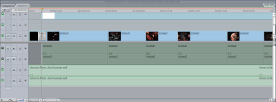

With so many options, buttons and the like - Final Cut could seem intimdiating on its first use. However, in respect to our intended 'indie' look that we had already established, we made sure to sure to avert many of these tools. If we had been asked to compose a music video for say, Katy Perry, Justin Bieber or the Black Eyed Peas - air brushing, special effects and a complete change in mise-en-scène would have been essential to maintain a sleek and glossy image that coincides with their superstar status. Our band would not slot in among these types, hence the avoidance of such procedures. Obviously, there were the necessities that were fundamental for the making of our music video. The 'in and out out points' were vital, allowing us to promptly select the precise segment of footage we desired to drag and insert on the Timeline. With over an hour of video, it would have otherwise been highly time-consuming without this particular implement. It was also important to remember to render the project each time a change was made, in order for the computer to process and permanently apply clips to the sequence. The idea of transitions is something we all further discussed as a group. Final Cut offers a vast selection, so it seemed silly to ignore these options. However when re-thinking the situation, transitions are best suited to ballads and mid-temp numbers - and the inclusion of one here would detract from the frantic and intense mood of their performance. Nonetheless, we did feature a cross-dissolve to fade in and out of the music video, as the sudden start and finish emerged as unprofessional.


Another tool we used towards our advantage was the Color Corrector. In our former draft cut, we had regrettably not made use of this option, but it's inclusion for the final cut was essential. Although provided with lighting at our chosen location, it was visible when re-watching the footage that the outcome was not as we hoped, depicting an unncecessary pink or red tint that I personally believed spolied the overall look of the video. Rather than shooting the entire film all over again, a more sensible idea was to use the Color Corrector. This device allowed us to adjust and improve the lighting conditions, whilst filtering any unwanted colours. Below are the before/after shots, and the difference is evidently substantial.

I was already thoroughly experienced with the Photoshop CS4 software, thanks to the previous tasks at AS and occasional practice in my own free time, and it played a central role second year running – for the production of our ancillary tasks. Neither me, James or Sarah shared enough knowledge on how to use html coding for the website option, therefore we decided on the digipak and poster design; so a photo-manipulation programme was entirely necessary to construct an authentic style which conformed to industry’s conventions. Many of the specific tools used to create both ancillery tasks were visited beforehand. These included the magnetic-lasso tool; to cut out the individual scrabble pieces, the hue/saturation levels; to strengthen the colours and the text tool for the obvious. However, one feature I had not noticed was how to skew an object. This was needed for the inside booklet, when placing the text "SORRY FOR THE INTELLECT" on the playing board. As the photo had been taken at an angle, it was important to tilt the text for it to be perceived as believable - and not as though it had been simply pasted over the top of the picture. The procedure was fairly simple: Edit > Transform > Skew - and from then on I naturally had to play around with the text until I was satisfied with the result.
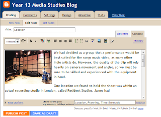


The particular site I am currently using to type this, Blogger, has been crucial for all presentation stages of our work. It has allowed us to post time-stamped entries and both quickly and regularly update on our progress. Every member of our group was already familiar with the tools, as a result of its usage at AS also. However without an introduction to Blogger, it would not have been possible to display our work through the other various media technologies, such as SlideShare and DivShare, and instead our work would have remained printed on plain paper, which would become tedious for myself and whoever chose to read the project.


Mozilla Firefox web browser was regularly used throughout the A2 course. Nowadays, the Internet is indespespensable for most and is relied on by many for both work and personal entertainment, with the ongoing expansion in social-networking sites (Facebook, Twitter etc). All information ever needed can often be located among the Internet, somewhere, thanks to the development of user-generated sites in recent years. Without online access, we couldn't host our work. We couldn't upload videos. Research would have been largely limited and we would instead have to go old-school, using the library as an alternative... which is likely to have been proven as ineffective and unproductive.
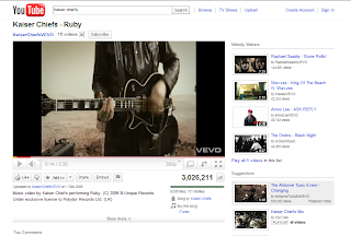


Although perhaps not a direct contribution towards our music video, video-sharing site YouTube allowed us to construct our research early on in the course. By watching tutorials and genuine music videos, we were able to come to grips first hand with the necessary conventions, whilst in the meantime conjuring ideas of inspiration. This site in particular is commonly known for displaying a wide variety in video content, with thousands of users uploading various clips every day, so YouTube was ideal for searching and analysing other music videos by artists within our bands select genre.
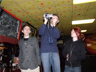


Obviously, the entire process would not have been remotely possible without a camera to shoot with. Within our school, the Media Studies department offer a selection of video cameras and our group had used the Sony DCR-HC62 - which specialises in recording footage. It's compact design allowed us to simply transport it around when filming the band, and it's tools were very simple to use; adjusting to its settings almost immediately.


The Grab tool is an application created specifically for Apple Mac computers, and was commonly used in the presentation process of our findings – specialising in capturing screenshots. This was a highly effective and advantageous piece of software, as it allowed us to promptly select an exact part of the screen to copy and then immediately save onto the computer, without opening a further photo-editing programme.


Vimeo was similarly used for the presentation process, to upload and host any of our videos (such as our animatic, audience feedback and various cuts). Alike YouTube, Vimeo is a video-sharing website in which much of its content is primarily produced by the site’s own users, and they show an exclusive dedication to this by removing most clips that neglect this rule. We were advised to use Vimeo by our teacher, and it was proven an ideal choice.


...and other Honourable Mentions.

dafont > A site solely for font downloads, offering thousands for free among their archives. Most of the typefaces used for our ancillery tasks had been found on dafont.com, therefore it was of great benefit to us.

Slide/DivShare > The aforementioned devices allowed me to display my work in new and exciting ways, rather than with pages of ordinary text, instead through the usage of sound clips and slideshow presentations. Both were highly beneficial and easy to utilise.

Photobucket > I chose to use this site last year to host various pictures for my blog, as it allowed animation and transparency for my images, whilst also keeping them organised in an orderly way. Although perhaps not the same extent, I continued to upload a few of my pictures there, as there were occassional technical difficulties and glitches with the tool provided by Blogger - which supposedly specialises in adding images.

Evaluation: Question 3

What have you learned from your audience feedback?

To recieve the audiences feedback on our product was a priority in order to perfect our video. Once our initial rough cut was completed, the video was screened within our media class and written feedback was provided from each person. This was an especially useful oppurtunity as it helped us recognise any potential issues early on, which may have not been altered or even noticed otherwise. All students in the class are also either 17 or 18 years old, so are within our specific target market by age. Many comments were positive, although we were also given various ways in which to elevate our video to a higher level. The main ideas discussed were; an increase in cuts during the final chorus for an energetic climax, to check all instruments/the singer were in sync and to improve the ending. A couple people also questioned the stability of the camera movement, although this was intentional to convey a hectic feeling and the bands vigor whilst performing. Further detail on the feedback received can be found here.

Once our edited cut was finalised, we were able to gather other opinions. We thought it would be a good idea to publish our video on social-networking site Facebook the second time around, for further feedback. We also decided to ask a more varied collection of students in person, most of whom do not study Media A-Level, to provide us with a general consumers view and to prevent any biased answers. We asked them all four separate questions, which were the following:

What did you enjoy about the video?
Do the visuals correspond well with the song, and if so how?
Do you think it looks like a believable and credible music video, and why?
What would you change to improve the video?

Their feedback is summarised below.


Evaluation: Question 2

How effective is the combination of your main product and ancillary texts?


According to our prior research, very few artists feature themselves on the album art of their digipak within the respective genre that our band would slot into. Instead, our exploration into this area suggested it would be most suitable to create an individual and eye-catching item of photography or abstract art that could construct a statement or encapsulate the general mood of the sounds included on the album, such as Foo Fighters, Sleigh Bells and Arcade Fire as pictured below. To simply include a screenshot from the music video would contradict the industry's conventions, because it is something buyers rarely come across today when browsing online or through record stores, except perhaps for live/acoustic non-studio albums in our instance - or occasionally single covers to advertise one particular track.


The Scrabble board game is played more often by people of a higher intellect, as it involves much work and deliberation of the brain, so the images evidently tie in with the album title. Furthermore, the video's limited use in colour is conveyed with the combination of mainly browns, blacks and whites among the digipak. A sudden use of flamboyant imagery and wild colours would confuse the audience and contradict with the bands rough and rugged look. 
Both anicllery tasks also correlate well with one another. The cover of the digipak is clearly featured on the magazine advertisement and is the main focus and the font used elsewhere, for the quotes extracted from reviews and the release date etc, is the same used on the back case of the actual CD - which again helps to continue a house style. Details of the single Licence To Dance is also included in the bottom right hand corner by way of promoting the two releases at once. I decided to create a cover for the track, following the continuation with the use of the wooden background. The cover interprets a literal meaning of the song, adding a light touch of humour from the band, and quite evidently combines well with its lyrics.


Evaulation: Question 1

In what ways does your media product use, develop or challenge forms and conventions of real media products?


In the 1980s music videos were a new and fresh phenomenon. Music channel MTV introduced a rising trend in using video as an extension of musical expression and also as a further way of advertisement for the song in question. Michael Jackson pushed the boundaries of this medium throughout his career as nobody else had ever done before him (see: 1, 2, 3), helping to assist his climb to global fame by invoking a reaction. From then on, music videos have become an essential method for musicians to gain larger audiences; to not only hear their music, but experience it as well through the use of visuals.

Performance videos are commonly more often used by bands, instead of solo artists or groups that do not play their own instruments, because it encapsualtes the raw energy of the band that would be present throughout one of their live concerts, providing the audience with an idea as to what to expect when visiting a gig of theirs. We decided as a group that this would be the best way forward for our own music video, to create an authentic and believable product that would conform to the usual conventions of the current period within the music industry. Although we initially questioned the use of a narrative concept, I believed the style and genre in music of the band is best suited to a video focussed on their performance; moreover, it was also difficult to contruct an interesting storyline that would not stray too far from the songs lyrics, whilst in the meantime maintaining a credible yet 'indie' image.

Throughout the development of our promo clip for the track Licence To Dance, it was important to remain fully aware of the necessary conventions needed for inclusion within the music video that would challenge everyday forms of genuine media products. These would involve a variety of camera/shots angles, well-lit scenes and an overall feeling of professionalism. I have always been a great fan of music in general, even prior to the assigned task, therefore I was already familiar with the usual traditions and conveyed a confident understanding as to what should be expected within a music video.

I shall analyse individual aspects of our finalised video, identifying comparisons between existing media products and our own in order to provide our music video with a sense of reality.


The mise-en-scène is the expression given to the visual themes and design aspects of a production, such as setting or costumes, and is very much significant to achieve a believable music video that is representative of the band's desired image. The use of scenery and other properties can radically alter people's interpretations of the song and its success in general, if the overall idea is too weak, inanimate or simply uninteresting to its audience. As aforementioned, performance videos are most famously used for bands within the rock and indie bracket and we hoped to capture this vibe of a live performance by specific choice of venue. The stage we hired had been the home to many a gig previously, by genuine artists within the music business, which already began to elevate the video's likelihood and credibility. Stage lighting was provided by the owner, as well as speakers on show to amplify the sound of the song, all of which contribute to a raw ambience.

Each member of the band was picked specifically, as they were fully trained in playing their respected instrument and all had access to their own. If we had decided to include somebody who was not familiar with the rules of the guitar/bass player/drums or naturally was not aware of the songs tabs and such - the band would appear incoherent as the particular member would seem awkward, unprofessional and undoubtedly out of time - consequently suggesting The Reverb is of a mediocre quality and all at once damaging their plausability due to their incoherency. Although the lyrics on paper may strike one as just another fun, dance track, the vocalists delivery sounds unexpectedly sharp and aggressive and we made sure to translate this with the performance, by use of exaggerated facial expressions and body language. The songs intensity is advanced further within the video by the choice of undertones. The dim lighting and lack of vibrant colours supports this and accomodates usual conventions, as most known rock musicians follow similar colour schemes with their own visions. To use bright shades of pink's and yellow's would completely detract from the sense of extreme power Licence To Dance obtains and would instead be best suited to something within the pop genre.


To accompany the band's laidback, homegrown image, it was necessary for casual clothing to be worn. Each member of the band was dressed a fine line between “grunge” and “indie”, by way of conforming to the genre’s conventions, to depict an image that correlates with the music. Plaid shirts, baggy/skinny jeans and gothic-themed slogan tees were worn, with little variation in colour, as it is what the majority of their target audience would be interested in buying and relates to the dull tones current in their surroundings for the video. It was also important to make sure that all chosen outfits were vastly different from each other, although not so different that they clash. This allows each member their own indivduality, as matching costumes would most probably diminish that, whilst their average taste in fashion makes them seem relatable to their fans. English band You Me At Six share a similar rock sound and understated look, as seen below. They have been proven a success, recently achieving a top 5 album on the UK charts, and are an established name within the indie and alternative sector, therefore I believe our band could use these conventions to find their own marketable space in the music industry.


Camera angles and movement are both very much important, specifically for music videos which are concentrated on a performance alone, as the quality of the outcome often depends on the skills of the person filming. In our specific case, the song is of a very fast pace and is highly energetic so this had to be reflected in the speed of the video. If the camera is static, the enthusiasm of the band when portrayed onto the screen would appear diluted and the result would be a next to lifeless video. If the footage is not strong enough, there is little you can do to save it; editing cannot perform miracles. We realised this our own way with our first shot at filming, as there was a lack of movement in the camera and the shortage in variation of angles would not provide the audience with an enjoyable enough performance - the majority of which were long shots of the entire band. However, we made sure to learn from previous mistakes and pay full dedication towards these vital conventions for future footage. As we were filming with a handheld camera, constant stability was a struggle to accomplish, yet we decided to further forcefully add random shakes and tilts ourselves. Much of the time, directors try their best efforts to keep movement to a minimum, but our research showed that magnified camera actions are common within the rock genre - especially with a song as upbeat as ours, and the word 'dance' in its title. One prime example is Ignorance by Paramore, embedded below. The camera is rarely still, depending on the section of the song, and we enforced these conventions in our own work.


As previously discussed, to produce an authentic and animated music video, a variation in camera angles is especially needed. Too much repetition of the same shots would eventually become tedious for the audience, as made evident with our initial attempts at filming, so we knew it was essential to shoot footage from all possible aspects. The contant use of close-ups was highly reguired for involvement. As stated by Andrew Goodwin:

"There's a demand on the part of the record company for lots of close-ups of the main artist/vocalist".

This is to familiarise the public with the faces of the band, in hope of becoming an established and household name, whilst also enabling a connection between the singer and viewer. The persistent inclusion of eye contact helps develop this further, creating a sense of intimacy as if the vocalist is directing his lyrics to you personally and hence portraying the band as attainable. Shots of the lead singer were embodied continously throughout the duration of our music video. Luckily, our choice in vocalist Jon, is the actual artist and writer of the track itself, so he was able to convey the song with much drive and emotion, resulting in a strong sense of authenticity. His accuracy with the words to the track also contributed to the conception of professionalism within the video. Moreover, close-ups of the intruments in action were crucial, as featured in all genuine performance videos. All chosen members could play their selective instruments at a high level, so they were able to flaunt these skills. Although a majority of angles incorporated in our work were close-ups, a range of others were unmistakably used. Medium shots of each indiviudal were interjected regularly, overhead shots of the drummer were included - as the drum kit would obstruct the audiences view of the member when filming head on - and distanced shots of the entire band demonstrated the group's togetherness.


The Reverb - Licence To Dance VS The Killers - Somebody Told Me

Editing was also highly important in conveying the look of a genuine music video that could potentially challenge the industries ordinary conventions. Quick cuts were regularly used in order to correlate with the uptempo pace of the song, and this sped up even further towards the end to create a dramatic climax for the audience, as a real sense of energy is apparent within the bands performance. As with many performance videos, we made a point to time the editing with the flow of the music. For example, the song kicks in once Jon jumps off the stage and hits the floor and the constant focus on the guitar throughout its solo. We all felt this created a strong feel of professionalism that helped it stand up among other similar videos in current times.